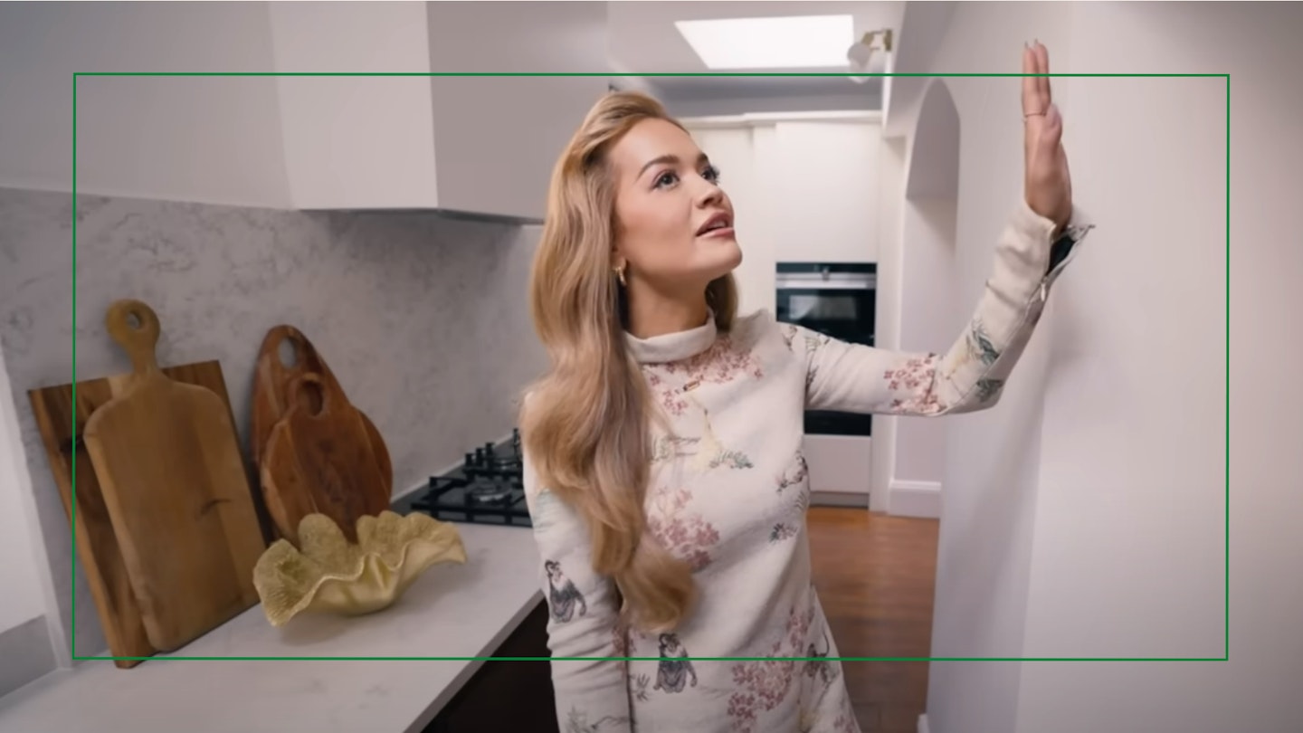
When it comes to finding kitchen wall art ideas to spice up your culinary space, it can be hard to know where to look for inspiration, especially if you’re after a trend that’ll go the distance.
Fortunately, interior design expert, Kelly Collins, explains how one TikTok trend will guarantee you’ll always be in love with your kitchen wall: dopamine dressing. Better yet, it's shown up in the homes of the celebs we often turn to for a little design inspiration.
One such kitchen that shows off this trend perfectly is that of Rita Ora. Earlier this year, the British singer-songwriter, opened her doors to Architectural Digest, giving the publication a tour of her gorgeous Victorian-era home.
Amassing over four million views, the video shares a sneak peek into her kitchen-dining space adorned with two statement pieces of artwork – a bold typography print by Gilbert & George, partnered with framed skateboard decks by Damien Hirst.
At first glance, you wouldn’t assume there’s much necessarily tying these two pieces together. But what makes her chosen artwork worthy of featuring on her kitchen wall is how personal it is to her. For Rita, the Damien Hirst was custom-made for her, while the Gilbert & George connected with her “rock and roll self”.
Our kitchens are the heart of the home and Rita has effectively chosen what she loves and has hit the trend - dopamine dressing – bang on the head.
What Is Dopamine Dressing?
While typically associated with clothing, dopamine dressing has crept its way into the interior world as 'dopamine decor' and in essence, is all about choosing something you love that will give your brain a dopamine boost when you enter your home. Along with a shift towards statement pieces of artwork (which we’ll touch on more later), it’s fair to say that achieving this ‘trend’ is extremely attainable.
How To Find Your Art Style
To effectively find your own dopamine-boosting artwork, interior design expert Kelly explains to A Modern Kitchen, that it’s completely down to the individual and what brings you the most joy.
“What makes you happy? You know, the texture. What makes you feel warm and cosy?” says Kelly, “What do you love looking at? What are you not going to get bored at? I love colourful ‘wow’ prints. But sometimes that could be maybe a bit too much for someone.”
But, Sally Coulden, artist and founder of Red Dog Glass Design tells AMK, that you can go beyond that, to determine the exact mood you want to set in your space.
“The key question is what sort of feel do you want? And then from there and I think with artwork, one often gets an emotional response from looking at it, and that either makes you smile or gives you a feeling, or it reminds you of something or you just really don’t like it.”
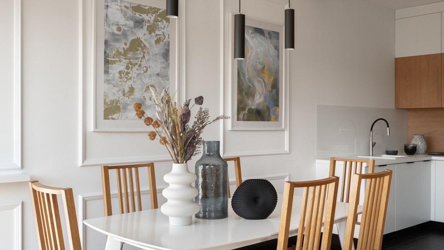
A piece of art can conjure memories, a feeling of calm, or just be something you love looking at – at the end of the day, it’s completely personal to you and what you want to feel in your kitchen. From there, you’ll be led to the piece that’s right for you, whether that turns out to be abstract, photo-realistic, or minimalist.
But if you’re a sucker for the trends like the AMK team, Kelly recommends going for it but on a smaller scale first. This way, you can almost try it on for size before committing to a larger artwork. For example, Kelly shared that right now eclectic bold tablescapes are trending - with some recommendations below. Ultimately, make sure it’s a trend you truly love for your home without simply bouncing on the bandwagon.
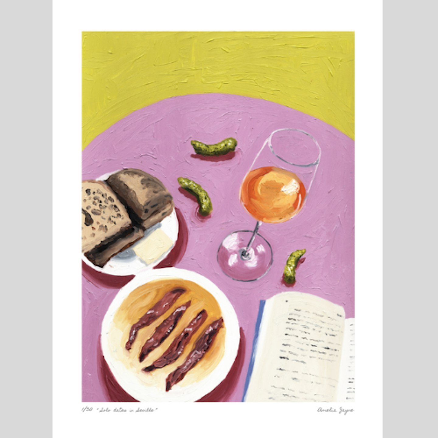 Amelia Jayne
www.ameliajayne.com
A vibrant tablescape that'll transport you to a relaxing morning in Seville.
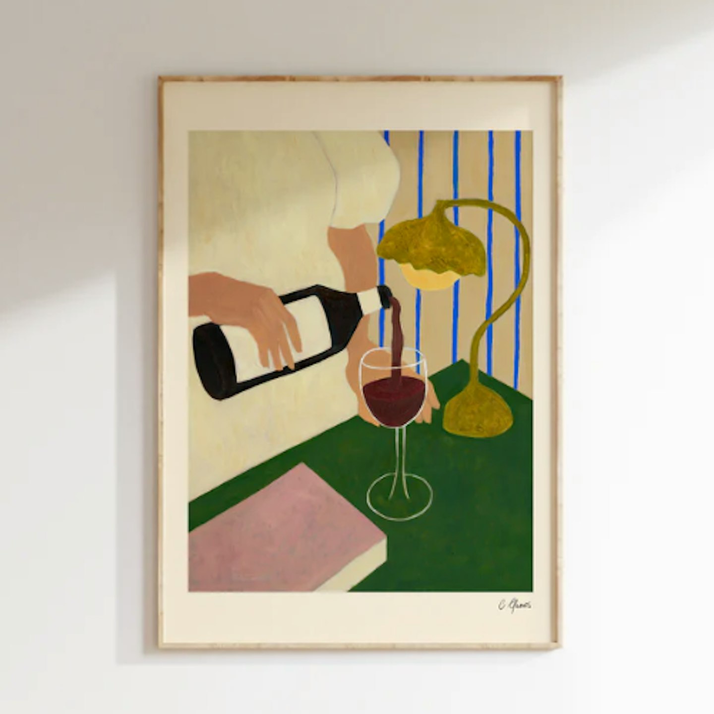 Carla Llanos
carlallanos.co.uk
A fine art print that celebrates wine, dinner parties, and times with friends.
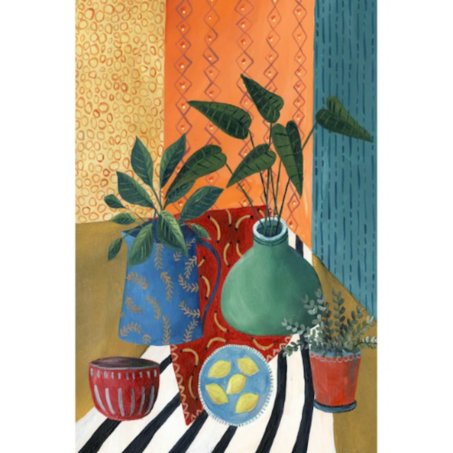 Wayfair
www.wayfair.co.uk
A bold canvas (perfect for plant lovers) that plays with colour and pattern.
Alternatively, if you’re not shy about getting creative, DIY your own artwork. What could be more personal than making something yourself or with loved ones? You can find inspiration in works of art you already admire and play around by layering different patterns, colours and textures for a visually dynamic piece. Rita’s choice of Damien Hirst was made using skateboards, after all, so let your imagination run wild.
How To Create A Statement
So, you’ve got a piece of artwork you love. Step two for those double-trend points is to make it a statement piece in your kitchen, opting for one or two pieces – as Rita has done - over too many. Not only does this help that character and personality shine through, it also helps to limit that ‘cluttered’ feeling that can quickly populate a kitchen.
“Towards the beginning and middle of this year, it was all about gallery wall art - little, smaller pieces all created and perfectly curated,” says Kelly. “There's already so much going on in the kitchen, right? Generally having a gallery wall is just going to make it look too much and too busy.”
We couldn’t agree more – our kitchens are often stacked with the hustle and bustle of everyday life with rogue appliances, dishes and more scattered about.
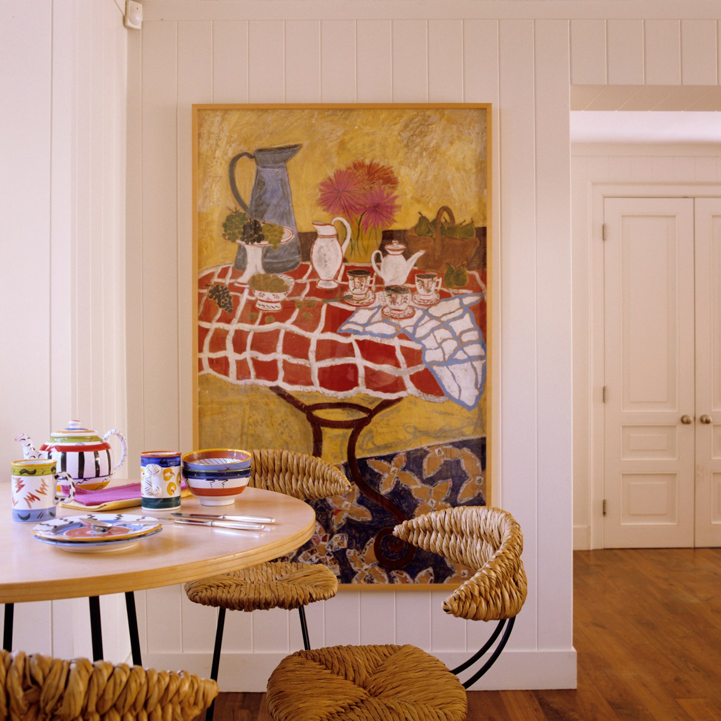
"Now it's just that big statement, wow-factor with artwork," says Kelly, "I love when you can have artwork in the kitchen, it just makes it feel more luxury." Opting for a larger piece helps to elevate the kitchen that little bit more as a space for cooking and entertaining. Not to mention, it makes for a fantastic talking point, too.
Of course, not all of us are blessed with huge kitchens and spacious kitchen walls. Thankfully, there are some simple and often inexpensive ways in which you can add your personal art that’ll instantly transform it into a statement piece.
Functional Artwork
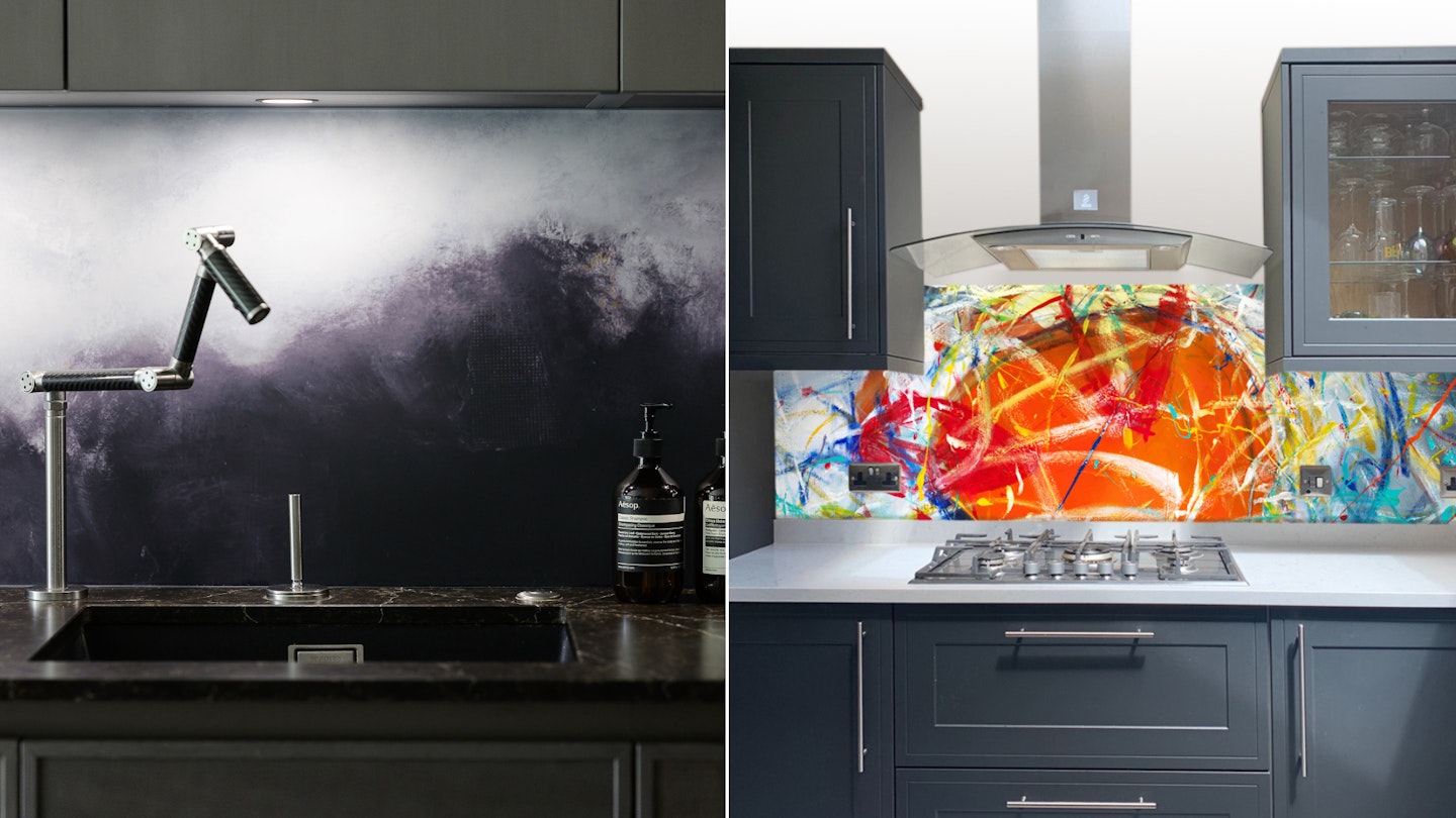
Whether you have a large or small kitchen, one hack is to make your artwork functional. On a limited budget, you could easily use vinyl kitchen wrap to add personality to your back wall, with plenty of ready-made designs available.
Or for a more luxurious, personalised option, you can have artwork turned into a splashback with Red Dog Glass Design. Sally says they create glass splashbacks that are "practical".
"They’re functional. You don’t need any grouting, it’s 220-degree heat-toughened glass. And have your own bespoke painting done for you.”
Framing
Framing can in itself make your desired piece of artwork stand out – even if you’re opting for a print. Kelly says that using simple floated frames is a great option that gives your artwork a unique and elevated look. That being said if you have quite a compact kitchen to contend with or want to prevent your space from becoming too busy, opt for a simple white frame instead.
If you're renting and using kitchen wall space is a no-go, Kelly suggests leaning the artwork on a shelf instead and playing with layering it in the space with finishes and textures. If you have some prized cookbooks for example, arranging these with a simpler piece of art could really make a statement.
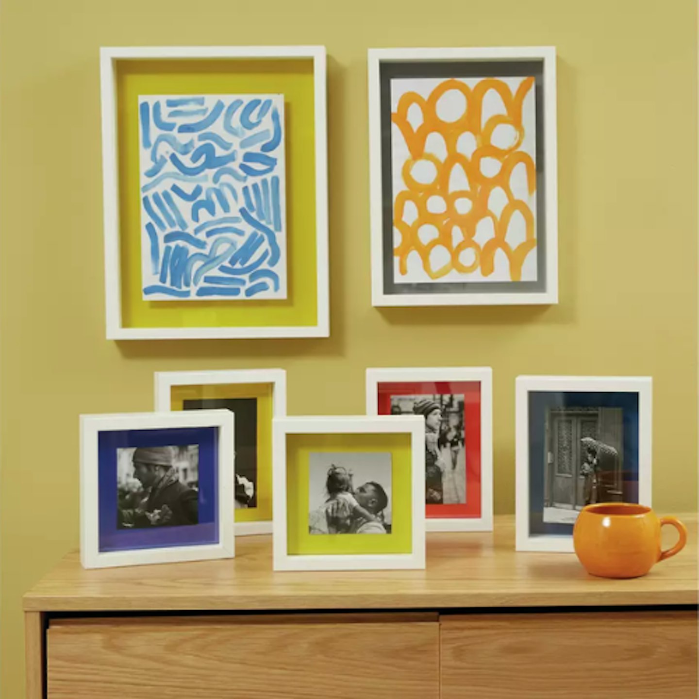 Habitat
www.habitat.co.uk
Habitat is home to floating picture frames that make for a contemporary and unique alternative to traditional framing. This one is A4 size, but others are available.
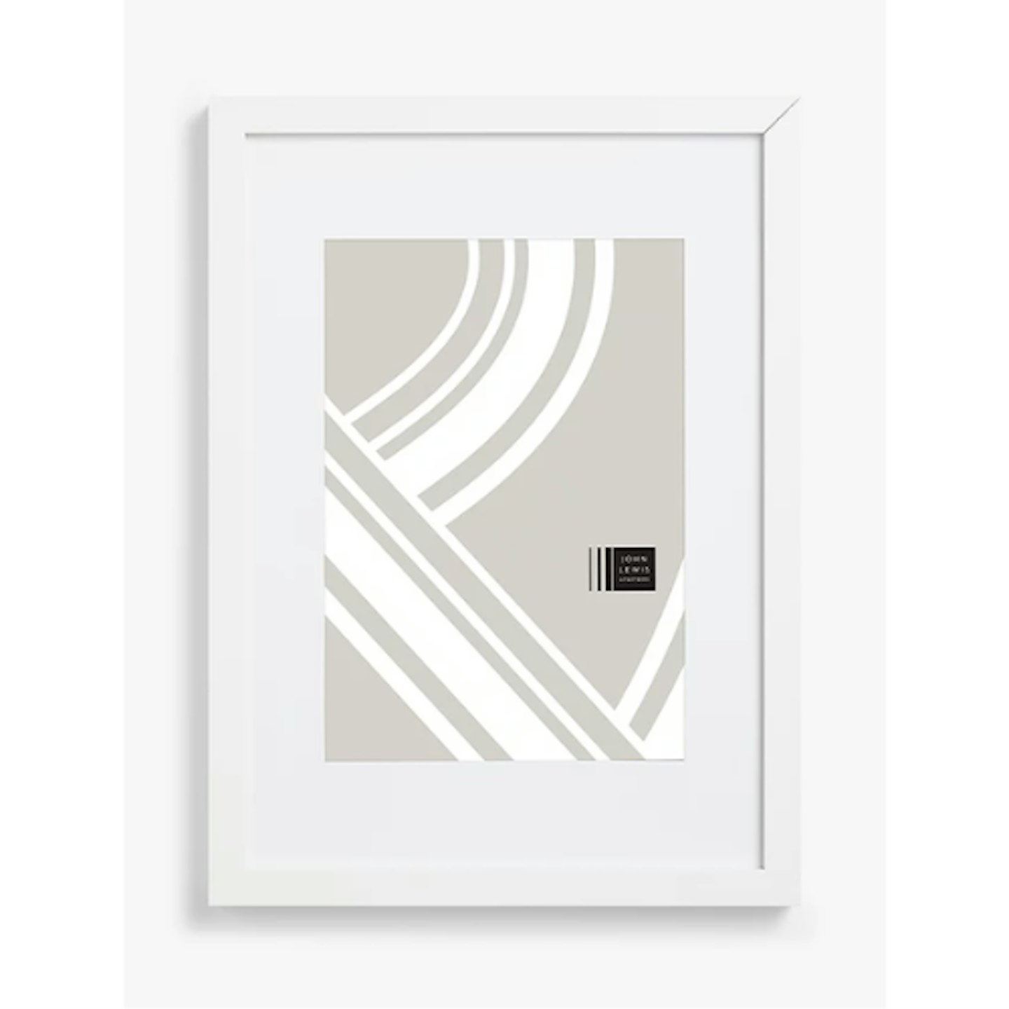
www.johnlewis.com
A simple white frame in a bunch of sizes, perfect for framing a bold print in a smaller space.
Lighting
Both Kelly and Sally agree that lighting in the kitchen is key. Kelly suggests that using lighting above artwork to illuminate it not only makes it stand out but also adds a quiet luxury with little extra effort. And you don’t need to spend a fortune either to get lighting fitted as battery options are available (we won’t tell if you don’t).
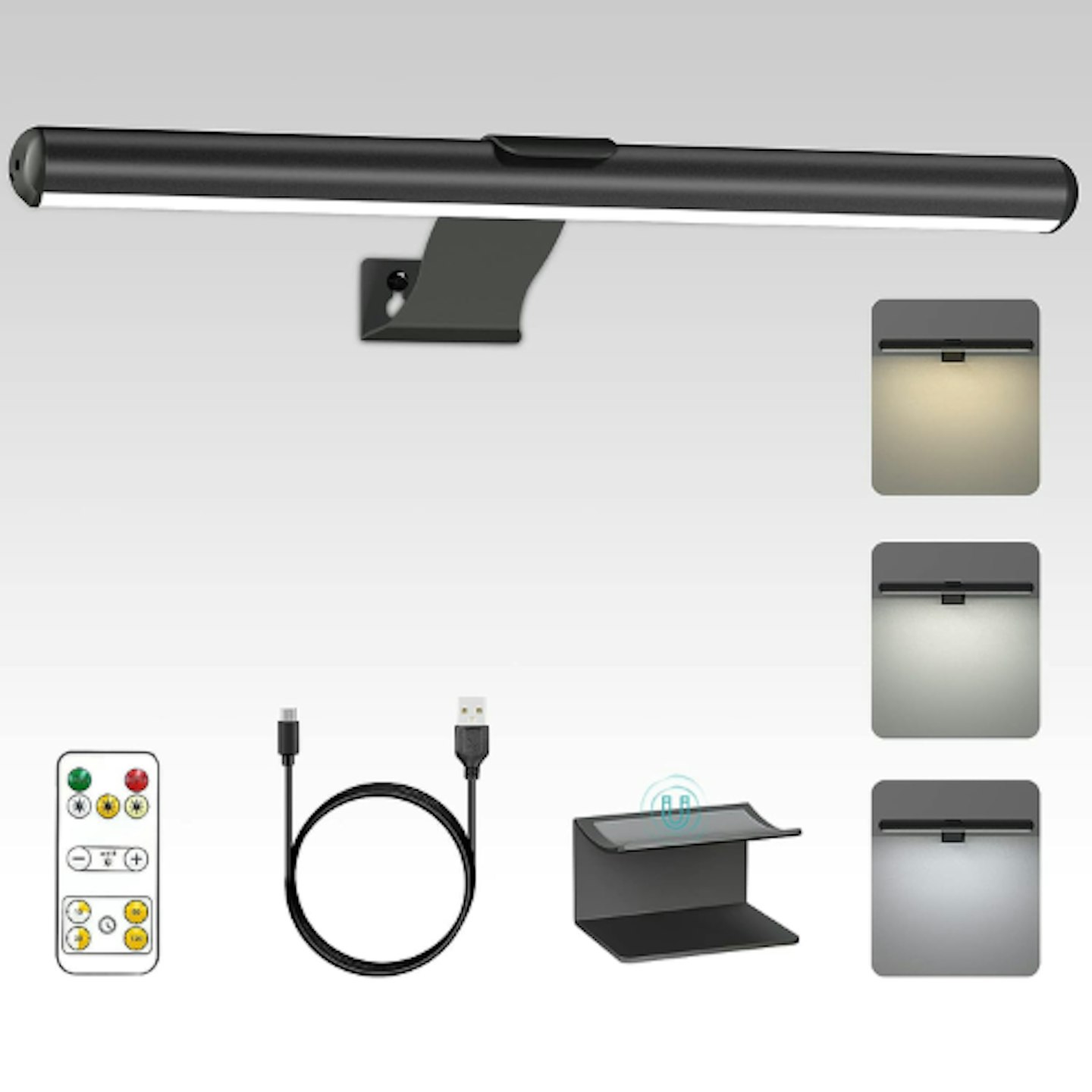 Amazon
Available in a choice of fixture colours, this wireless picture light has three lighting modes, a rechargeable battery and a remote to customise your lighting at will.
About our experts:
Kelly Collins is Interior Designer & Head of Creative at Swyft. As the company's in-house Interior Designer, Kelly orchestrates innovative design solutions and trend forecasting for colour, texture and pattern. Previously, Kelly studied Interior Architecture and devoted a decade to meticulously crafting exceptional interior spaces for high-end residential projects and boutique hotels across the UK and the captivating landscapes of the South of France.
Red Dog Glass Design founder, Sally Coulden, is a professional abstract landscape painter who grew up in a creative household in the wilds of Norfolk in the UK. Art has been a constant thread throughout Sally’s life and after many career twists and turns, she decided it was time to return to her love of painting. She attended art school eight years ago and since then she’s launched Red Dog Glass Design which brings art into living spaces in a functional way.
Eleanor Weaver is the Deputy Homes & Garden Product Editor for A Modern Kitchen, specialising in kitchen accessories and appliances, including washing machines and microwaves. Having been a renter for a decade now, she loves looking for home inspiration in her spare time and is a master of DIY.
